Key Highlights
- Use high quality DTF transfers and correct color profiles for better results.
- Proper DTF transfer brightness settings directly affect final print output.
- Following a solid DTF vibrant colors guide improves consistency.
- Correct curing and pressing help increase vibrancy for DTF shirts.
- Choosing the best inks for vibrant DTF prints enhances color depth.
If your prints look dull, faded, or just “okay,” you’re not alone. Many people struggle with getting that bold, eye catching finish they see in professional results.
The truth is, DTF transfers can produce incredibly vibrant prints, but only if everything is set up correctly. From your design file to your printer settings and even your curing process, every step matters.
In this guide, we’ll walk through exactly how to increase DTF print vibrancy in a simple, human way, so your prints look brighter, sharper, and more professional every time.
Why Your DTF Prints May Look Dull
Before fixing the problem, it’s important to understand what’s causing it. In many cases, dull prints are not due to one issue, but multiple small mistakes. Poor artwork, incorrect color settings, low quality ink, or even wrong heat press settings can all affect results.
If you want to make DTF prints more vibrant, you need to treat the process as a complete system, not just focus on one step.
Start With High Quality Artwork
Your final print is only as good as your design file. Low resolution or poorly prepared artwork will never look vibrant, no matter how good your printer is. To improve DTF print color, always use high resolution images (300 DPI or higher) and work in the correct color mode.
Artwork Tips That Make a Difference
- Use RGB for design, then convert properly for printing
- Avoid dull or washed out colors in the file
- Increase contrast slightly for better output
- Use transparent backgrounds when needed
These simple adjustments play a big role in DTF transfer color optimization.
Choose the Right Color Profile
One of the biggest secrets behind vibrant prints is color management. Using the wrong ICC profile can make colors look flat or inaccurate. A proper profile ensures your printer translates colors correctly from screen to fabric. This is a core step in any DTF vibrant colors guide and is essential if you want consistent results.
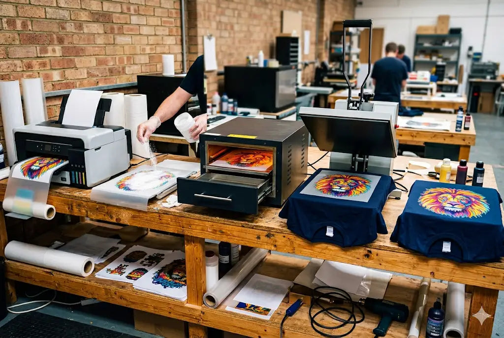
Use the Best Ink and Materials
Not all inks are created equal. Cheap or low quality ink often produces faded or inconsistent colors. If you truly want to increase DTF transfer color brightness, invest in high quality ink designed specifically for DTF printing.
What to Look for in Ink
- Strong pigment concentration
- Consistent color output
- Compatibility with your printer
- Proven results in DTF printing
Using the best inks for vibrant DTF prints makes a noticeable difference in color richness and durability.
Optimize Your Printer Settings
Printer settings are often overlooked, but they directly impact vibrancy. To achieve the best settings for vibrant DTF prints, you need to fine tune your machine.
Key Settings to Check
- Ink density levels
- Print resolution
- Color saturation
- Pass count
Adjusting these correctly helps increase DTF transfer color brightness and ensures your prints pop.
Perfect Your Powder and Curing Process
Even if your print looks great before curing, it can lose vibrancy if the process isn’t done properly. Incorrect temperature or curing time can dull colors and affect adhesion.
To truly increase vibrancy for DTF shirts, make sure your powder application is even and your curing process is consistent.
Heat Press Settings Matter More Than You Think
Your heat press is the final step, and it can make or break your print. Incorrect pressure, temperature, or timing can reduce color vibrancy and affect the finish.
Ideal Pressing Tips
- Use the correct temperature (usually 150–165°C)
- Apply medium to firm pressure
- Follow recommended pressing time
- Peel at the right stage (hot or cold)
These steps are part of essential DTF print vibrancy tips that professionals follow.
Fabric Choice Can Affect Vibrancy
Not all fabrics display colors the same way. Some materials absorb ink differently, which can impact brightness. Cotton, polyester, and blends all react differently to DTF transfers, so testing on your chosen fabric is important. Choosing the right material helps make DTF prints more vibrant and consistent.
Boost Contrast and Color in Your Design
Sometimes, the easiest way to improve vibrancy is to adjust your design itself. Slightly increasing contrast and saturation can make a big difference in how colors appear after printing. This is a simple but effective method to improve DTF print color without changing your entire workflow.
Common Mistakes That Kill Vibrancy
Even small errors can reduce print quality.
Avoid These Mistakes
- Using low resolution artwork
- Incorrect ICC profiles
- Cheap or incompatible ink
- Over curing or under curing
- Wrong heat press settings
Avoiding these helps maintain strong DTF prints color punch and professional results.
Real World Tip: Test Before Full Production
Before printing large batches, always test your settings. A small test print allows you to adjust colors, brightness, and settings before committing to a full run. This is one of the most practical DTF print vibrancy tips that can save time, money, and frustration.
How to Build a Consistent Workflow
Consistency is key in DTF printing. If you want reliable results, create a repeatable process, from design to pressing. Use the same settings, materials, and workflow every time. Following a structured DTF transfer color optimization process ensures every print meets your standards.
Conclusion
Vibrant prints don’t happen by accident, they’re the result of the right setup, materials, and techniques. By following these tips, you can turn dull prints into bold, professional quality designs that stand out.
If you’re ready to upgrade your printing quality and get premium DTF transfers, explore trusted solutions at DTF West Coast.
FAQs
1. Why do my DTF prints look faded after pressing?
DTF prints may look faded due to incorrect heat press settings, poor curing, or low quality ink. Ensuring proper temperature, pressure, and curing process helps maintain vibrant and long lasting colors.
2. Can humidity affect DTF print vibrancy?
Yes, humidity can impact powder adhesion and ink performance, leading to dull prints. Maintaining a controlled environment ensures consistent results and helps preserve strong color vibrancy in prints.
3. Does printer maintenance affect color output?
Yes, clogged print heads or poor maintenance can reduce color accuracy and brightness. Regular cleaning and calibration ensure smooth ink flow and better overall print vibrancy.
4. Is white ink important for vibrant prints?
Yes, white ink acts as a base layer, especially on dark fabrics. A strong white base enhances color brightness and ensures designs appear vivid and clear after pressing.
5. Can over curing damage print vibrancy?
Yes, over curing can burn or dull colors, reducing vibrancy. Following correct curing time and temperature guidelines ensures colors remain bright and prints maintain their quality.
6. Do different printers produce different vibrancy levels?
Yes, printer quality and technology affect color output. High quality printers with proper settings deliver more vibrant and consistent results compared to low end or poorly calibrated machines.
7. How does powder quality affect vibrancy?
Good quality powder ensures proper adhesion and smooth finish, helping colors appear brighter. Poor powder can create uneven textures and reduce overall print vibrancy and durability.
8. Can I fix dull prints after pressing?
It’s difficult to fully fix dull prints after pressing. Adjusting design, ink, and settings before printing is the best way to ensure vibrant and high quality results.
9. Does fabric color impact print brightness?
Yes, darker fabrics rely heavily on white ink for brightness, while lighter fabrics show colors more naturally. Choosing the right base improves overall vibrancy and final appearance.
10. How often should I calibrate my printer?
Regular calibration, ideally weekly or after heavy use, ensures accurate colors and consistent output. This helps maintain vibrant prints and prevents unexpected color shifts during production.
Share:
How to Design the Perfect Custom Shirt for Events and Festivals
How Do DTF Transfers Work? Step-by-Step Process