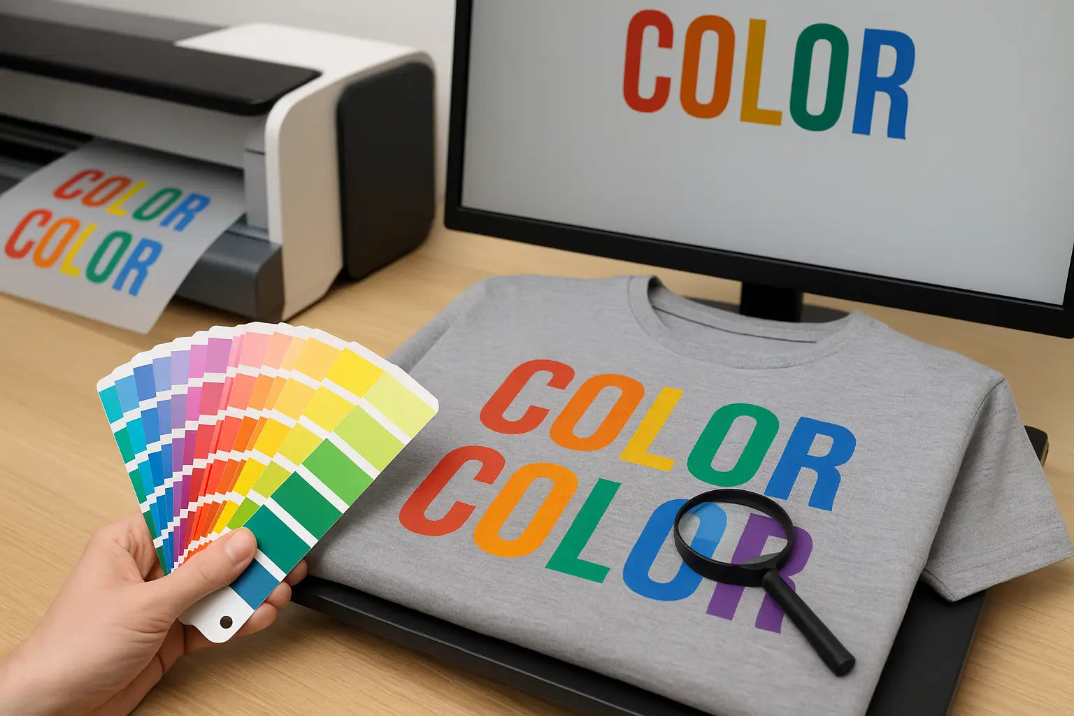
You're not the only person who has recognized that the colors in a design don't appear exactly as they did on your computer screen. A DTF color mismatch is one of the most vexing issues for designers and print businesses. If the design is brilliant and lively in digital form. It can look dull, overly dark, or just "off" when printed.
Color accuracy matters for both professional branding and customer satisfaction. In this guide, we’ll explore why your DTF colors don’t match your screen and how to fix them using proven DTF color correction techniques.
1. Why Colors Look Different from Screen to Print
The main reason for the screen vs print color difference comes down to how colors are created. Your screen displays images using RGB light, while printers work with CMYK ink. This shift means some bright RGB colors can’t be reproduced exactly in CMYK.
Another factor is the type of fabric you’re printing on. Even with perfect DTF printer color management, materials absorb and reflect ink differently, changing how colors appear.
2. Common Causes of DTF Color Mismatch
Understanding the source of the problem helps in applying the right fix. Some common DTF transfer color problems include:
- No color calibration for DTF printing: Without calibrating your monitor and printer, what you see is rarely what you get.
- Incorrect ICC profiles: Using the wrong profile can lead to prints that don’t match your design.
- Unoptimized print settings: If you’re not using the best color settings for DTF printing, your results can vary widely.
- Low resolution files: Poor quality artwork will produce muddy prints.
- Ink saturation issues: Too much or too little ink can cause color distortion.
3. How to Fix DTF Color Issues
Here are effective methods to ensure your DTF colors don’t match your screen problem becomes a thing of the past:
Calibrate Your Monitor
Frequent monitor calibration guarantees that the output on your screen closely resembles the printed version. For accuracy, use a professional calibrating instrument.
Use the Right ICC Profile
Installing and using the correct ICC profile for your printer model helps you maintain DTF color accuracy and avoid unnecessary adjustments later.
Adjust Color Settings in Design Software
When adjusting colors in DTF designs, work in CMYK mode from the start. This ensures you’re designing with print limitations in mind.
Test with Small Prints First
Before printing a full batch, create small test swatches to see if your colors translate well from screen to fabric.
Maintain Your Printer
Essential DTF printer color management includes routine cleaning, nozzle inspections, and appropriate ink storage. Colors that are incorrect or drab can result from poor care.
4. Preventing DTF Color Mismatch in the Future
Prevention is always better than correction. Here’s how to keep your prints consistent:
-
Stick to a color calibration for the DTF printing schedule.
-
Use consistent print settings for each project.
-
Store your inks properly to avoid chemical breakdown.
-
Keep fabric choices in mind; some textiles need slightly altered color settings.
By following these best color settings for DTF printing. You’ll significantly reduce issues where your DTF print looks different than design.
Conclusion
When it comes to time, supplies, and consumer trust, color mismatch can be expensive. You may produce prints that consistently reflect your vision by comprehending the causes of DTF transfer color issues and putting the appropriate fixes in place.
Visit DTF West Coast. for dependable DTF printing solutions, knowledgeable guidance, and high-quality materials.
FAQs
1. Why do my DTF prints look different from my design?
Your prints differ due to RGB vs CMYK color differences, fabric absorption, and lack of calibration. Correct ICC profiles and consistent printer maintenance help improve accuracy.
2. How can I improve DTF color accuracy?
Use proper ICC profiles, calibrate your monitor, design in CMYK mode, and maintain your printer regularly. Test small samples before printing the final batch for consistent results.
3. Why do DTF colors look dull?
Dull colors often result from low ink saturation, poor quality files, incorrect print settings, or clogged nozzles. Maintaining your printer and adjusting saturation levels can restore vibrancy.
4. Can fabric type affect my DTF print colors?
Indeed, color sharpness and brightness are influenced by cloth. To get correct results on a variety of textiles, color changes may be necessary because different materials absorb ink differently.
5. How often should I calibrate my monitor for DTF printing?
Calibrate your monitor every 4 to 6 weeks to maintain color consistency between your designs and printed results. Frequent calibration ensures minimal screen vs print color difference.
Share:
DTF Printing Mistakes to Avoid: From Setup to Final Press
DTF Printing for Fitness and Activewear Brands